Monday 7 February 2011

Contents Page Make-over

1.2.


3.
Number 3 Is my final idea. I had thoughts that number 1 was not how my magazine was meant to be represented. It didn't have the right feel to it. I then re-planned my design (several times) and came up with number 3.

Friday 28 January 2011

Double Page Spread Progress


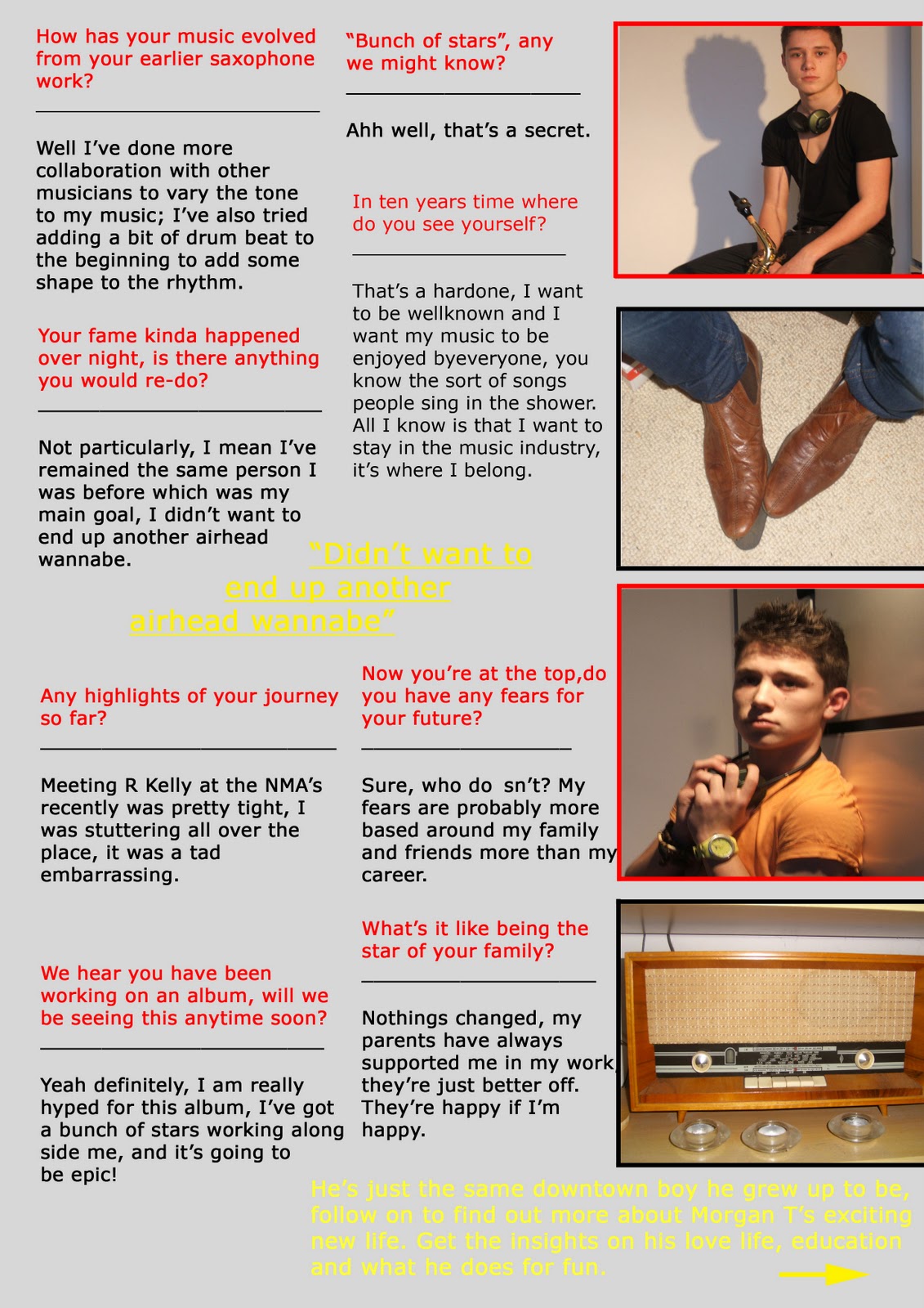
Using the gold/yellow colour to highlight the pull quote, standfirst and follow up. Keeping with the house style of the magazine with the use of red, black and yellow/gold. All that's left to do I feel is to add 3 more photos on the 2nd page, right-hand side. This will complete the look.

Contents Page Progress

I adapted the colour various amounts of time to not only keep the house style flowing but to make sure the writing was able to stand out and that the photographs didn't fade behind. To finalise my contents page I just need to add a few more photo's so the reader has a connection with the content of the magazine.